The church is often understood to be one of the few institutions that avoids focusing on the objectives of marketing. However, as the world becomes increasingly digitised and fast-paced, it is critical for religious organisations to focus on creating an impressive visual brand identity.
By designing an appealing church logo using relevant symbols, colours, and fonts, you could spread awareness about your church and its message more efficiently. Your logo is likely to be the first thing that people notice on websites, brochures or billboards. So it should be something that sets you apart from other organisations and inspires faith and hope in God.
In order to make sure that your church logo encourages people to participate and connects with them, you need to avoid these few design mistakes.
1. Using the cross and other common church symbols
There is no hard and fast rule that you have to incorporate certain symbols in the brand identity design to show your association. In fact, it is better to stay away from icons such as the cross or the Jesus fish since they are used commonly in such logos.
This is one design mistake that could prevent your church from reaching out to a larger audience and convincing them to visit or join. Look at it this way. If you design your church logo around these religious symbols, it is just going to be like the majority of other church brands. The goal is to show the community that you have something different to offer.
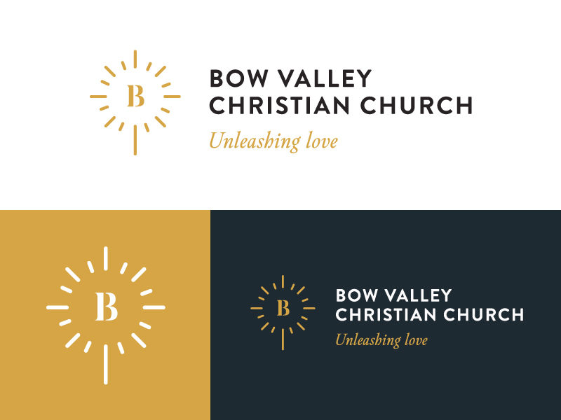
With a unique and creative brand symbol, you can attract the eye of different groups on print and digital mediums everywhere. Take the example of the logo for Bow Valley Christian Church below. The organisation has managed to avoid a cliché design and used a B lettermark within an abstract shape linking to their slogan ‘unleashing love‘.

2. Highlighting religious buildings or structures
This is a mistake that could take away the message or purpose from your church logo. As a religious organisation, you might think that the building or structure of the place of worship would make your graphic more appealing. However, it really isn’t the most effective design decision.
By having people focus on a building, you could promote the wrong idea to audiences who are potentially interested in joining the church. Put simply, using building imagery tells the audience to pay attention to the architecture and the surface appearance of the church instead of searching for a deeper meaning. The church is about spreading the good news of The Gospel by connecting communities together and encouraging members to become firm in their Christian faith.
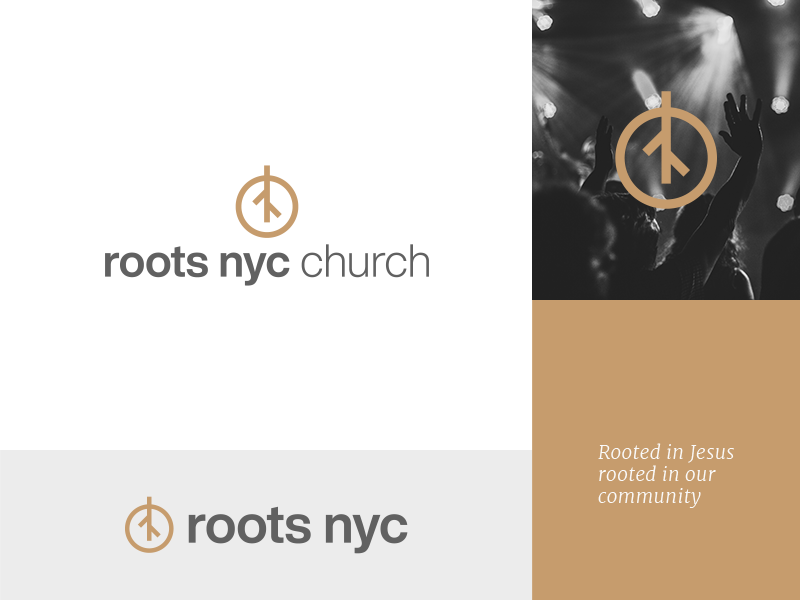
You don’t want people to think that the building or even the structure of the service is the most important part of coming to church. In order to make your logo meaningful, you can try and include simplistic symbols from the Bible or iconography that links to your Church values, such as a bird, candle, or the roots of a plant/tree in the example below.

3. Following common trends
While there is nothing wrong with having a modern brand identity design for a church, you may want to stay away from following new trends too actively. Often, religious institutions and churched opt for a contemporary brand name or use certain colours in their logos which they think will help them attract younger audiences.
If done creatively, it could pay off. However, a lot of the time this approach results in a logo that is only effective in the short term and isn’t designed with long term success in mind. For instance, using bold colour gradients or three-dimensional typography that is ‘in trend’ at the time may not be a decision that allows your brand identity to endure and encourage future generations to visit your church.
When choosing elements such as colours or fonts for your church logo, you have to consider their deeper meanings or associations. More attention should be given to the connotations of symbols and colours used and the adaptability of the logo rather than a primary focus on design trends.
4. Using confusing words in the slogan
If you opt for including a slogan in a version of your church logo, the choice of words for the slogan has to be made very carefully. You want the slogan to be clear and concise, whilst communicating your church’s unique vision or mission. This can be slightly tricky and it’s where a lot of churches go wrong.
Confusing words that aren’t fully relevant to people search for a church or aren’t easily understood by non-Christians are likely to turn people away. If you are using descriptive words in your slogan, such as ‘traditional’ or ‘contemporary’, you should make sure it really does line up with the characteristics of your church family.
In addition, it is also recommended to avoid using acronyms or modern words to connect with young adults or teens. This runs the risk of coming across a little cringey or cheesy.
According to a report published by Small Biz Genius, people generally remember logos after coming across them 5 to 7 times. If you have a slogan in your logo, try to make it catchy yet relevant so that the audience can remember and associate the design with your church after having viewed it only a few times.
5. Settling for an unprofessional design
This may seem obvious, but in the end, your logo has to come across as professional as possible in order to attract people and encourage them to visit your church. So, to make sure that you come up with a suitable church logo design, you need to consult a professional or get an expert opinion.
At times, religious organisations can make the mistake of going for designs that have been created by amateurs, committee members or even quickly designed on online logo makers. While there may seem to be nothing wrong with this in practice, it could be the reason why your logo fails to connect with audience. Effective and impactful logo design is a difficult process that requires careful research and a considered, professional approach.
Wrapping up – 5 church logo design mistakes to avoid
These are some of the church logo design mistakes that you must avoid. Since they can be commonly made, you should keep them mind when coming up with your brand identity design. This way, you have a higher chance of gaining the attention of people who are seeking Jesus in their lives and are searching for a church family where they can feel at home.
Author profile
David Anderson is a business graduate with a marketing major. He specialises in communication design and has helped many brands achieve their goals in marketing communication. Now he writes for freelance clients on topics related to brand design, visual communication, and marketing.


