Engaging brand identity design for a growing church
Harbour Church Portsmouth
Harbour Church Portsmouth is a church that strives to “play its part in the re-evangelisation of the nation, the revitalisation of the Church and the transformation of society.”
Clear Design was approached to assist in facilitating the church’s mission by creating a compelling brand identity that people would be attracted to. The logo needed to be a minimal icon that would communicate the ‘harbour’ aspect of their identity. The informal, welcoming and relaxed character of the church also needed to be incorporated into the final design.
Initial logo concepts
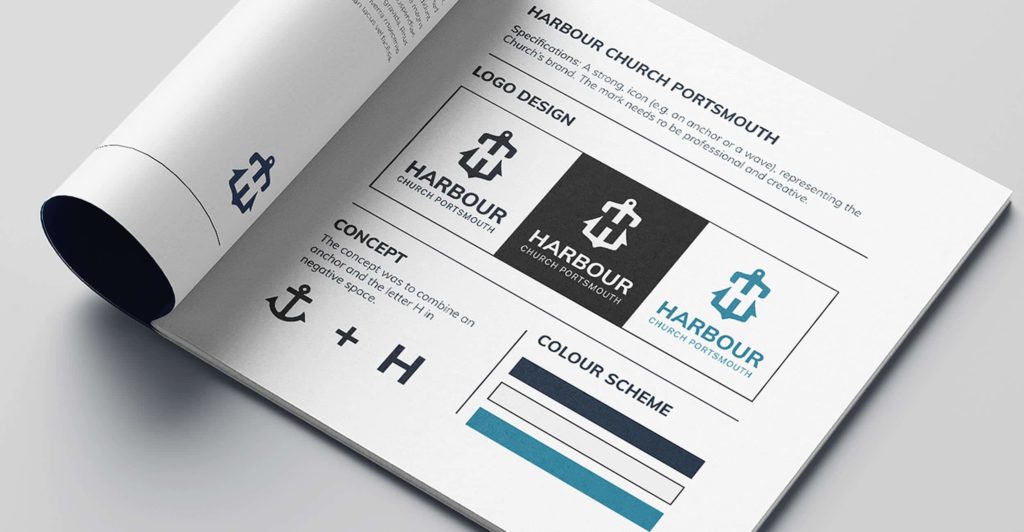
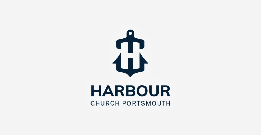
Two logo concepts were presented to the church. The first logo design combined an anchor icon with the letter H from the church’s name.
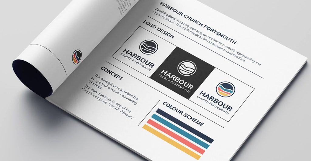
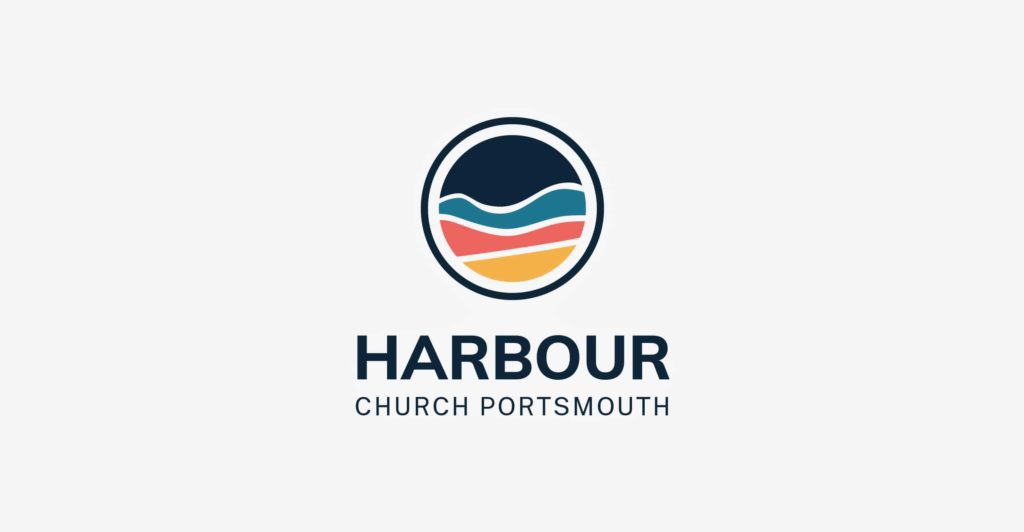
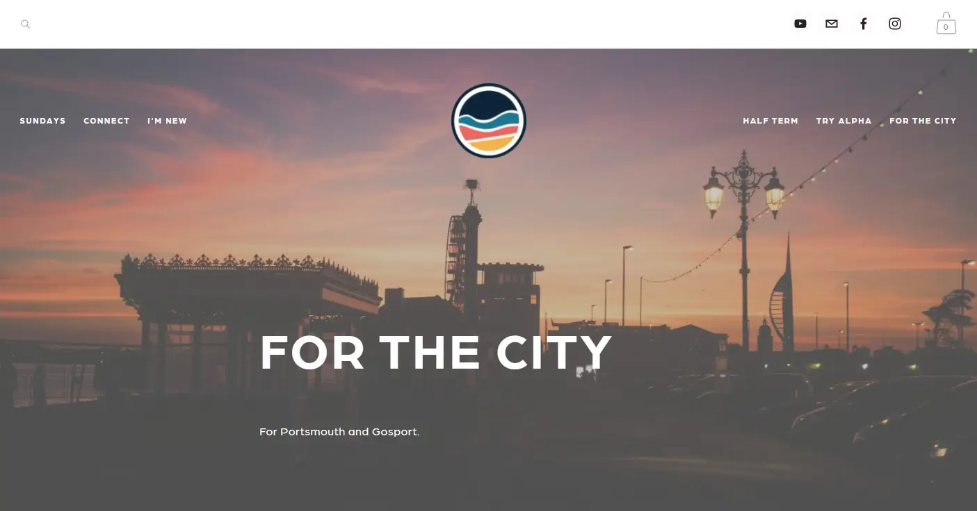
The second concept was a softer logo design with an outer ring linking to the church’s slogan ‘For All. Always’. Importantly, the ‘Harbour’ aspect of the brand was also incorporated into the logo through the ocean imagery. A bright colour scheme was used to represent Harbour Church Portsmouth’s welcoming and encouraging characteristics.
Logo design concept 1
Logo design concept 2
The final identity
In the final stage of the logo design process, the church chose their preferred identity concept – the circular, ocean logo. The chosen design was then fine-tuned and delivered to Harbour Church Portsmouth in multiple configurations for various print and digital applications. The result was a friendly new identity for the church that feels both approachable and modern.
Client recommendation
"Clear Design was absolutely exceptional in providing creative, well thought out and unique logo design options for us. Their work was professional and of the highest quality. We at Harbour Church Portsmouth could not recommend them more highly.”
Jess Elliot
harbour Church Portsmouth
Do you need help with a branding project?
Each branding project is a unique experience that starts with a personal consultation. So if you are interested in hiring us or you would like to hear more about our branding services, please get in touch.