Brand identity design for a home-schooling resources business
The Learning Box
The Learning Box is a start-up business looking to provide fun, enriching home-schooling resources to families with young children all across the UK. Each box contains projects designed to reach the UK’s education curriculum for children.
Clear Design was approached to create the brand identity for the new company. The logo needed to be an eye-catching mark that would communicate the fun, childlike aspect of the company’s products. Visual links to children’s learning also needed to be incorporated into the final design.
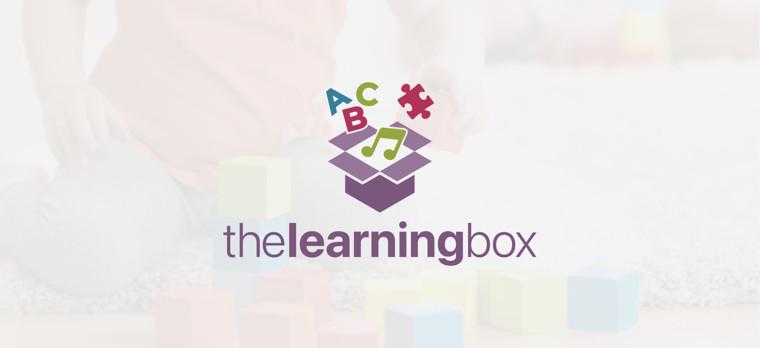
Logo construction
The chosen logo was created using an isometric grid and is carefully constructed to have a balanced style. The logomark is centred above the typography, further contributing to the well-balanced, refined feel of the full lockup.
Logo options
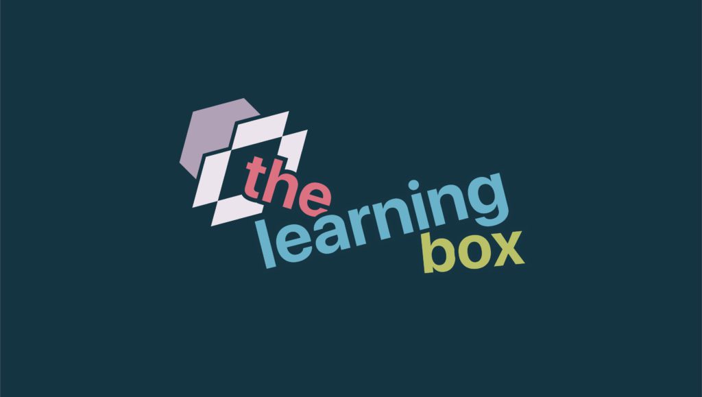
Two initial concepts were presented to the client. The first utilised symbols that connote children’s learning in a structured layout while the second experimented with colourful, playful typography in an asymmetrical design. The client decided to proceed with concept 1 as their chosen design.
Logo design concept 1
Logo design concept 2
Colour scheme & iconography
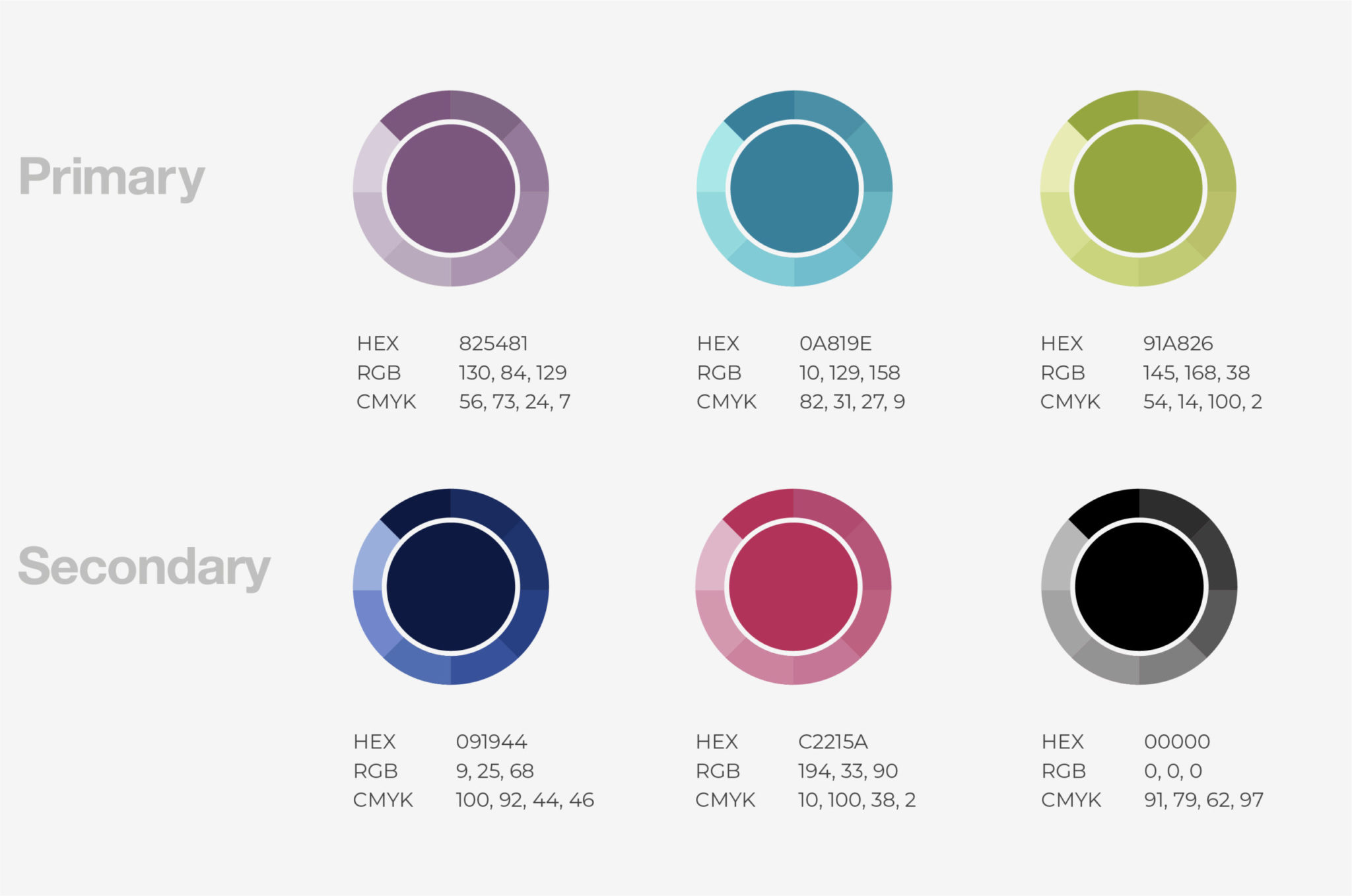
As part of the brand guidelines provided, a primary and secondary colour scheme and icon system were developed.
Colour adds personality and instant recognisability to a brand. The purple, green and blue primary colours give this colour palette a distinctive and vibrant appearance. Utilising the colour scheme, the custom icons were designed to bolster The Learning Box’s playful brand style.

Do you need help with a branding project?
Email: hello@cleardesign.studio
Call: +44 (0)7933 160505

View more design projects
Video Alliance
Logo design and brand guidelines for a Danish video production company.
Innate Active
Logo design for a custom sublimated swimwear brand based in Orange County, California, USA.
More projects
View more of our branding and website design & development projects.